Recording a meal can feel remarkably like submitting an expense claim. There are fields to complete, numbers to reconcile, and the faint suspicion that someone will judge you on the bread. You wanted to take better care of yourself. Somehow, you acquired more administrative responsibilities.
When designing NiaHealth’s nutrition experience, we kept coming back to the person holding the phone. They have a day underway. Breakfast happened somewhere between getting dressed and finding the keys. Dinner is still a loose intention. Our job is to make that day easier to understand. So we gave it a sky.
Why your day is shaped like a sky
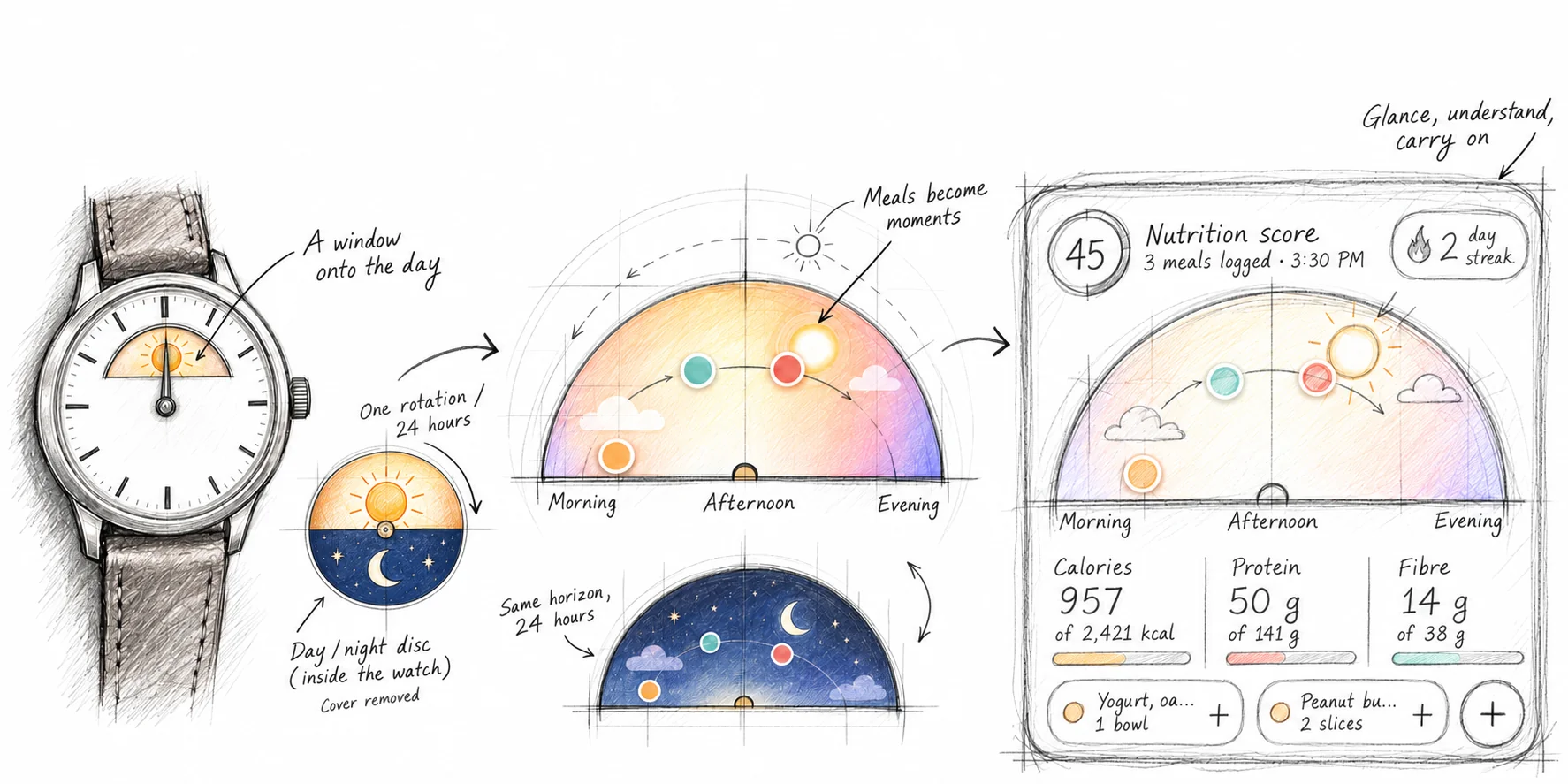
At the centre of Today is a dial that changes with the hours. Daylight gives way to evening. Meals appear as small marks within it. The numbers have a setting now: a day the person recognises as their own.
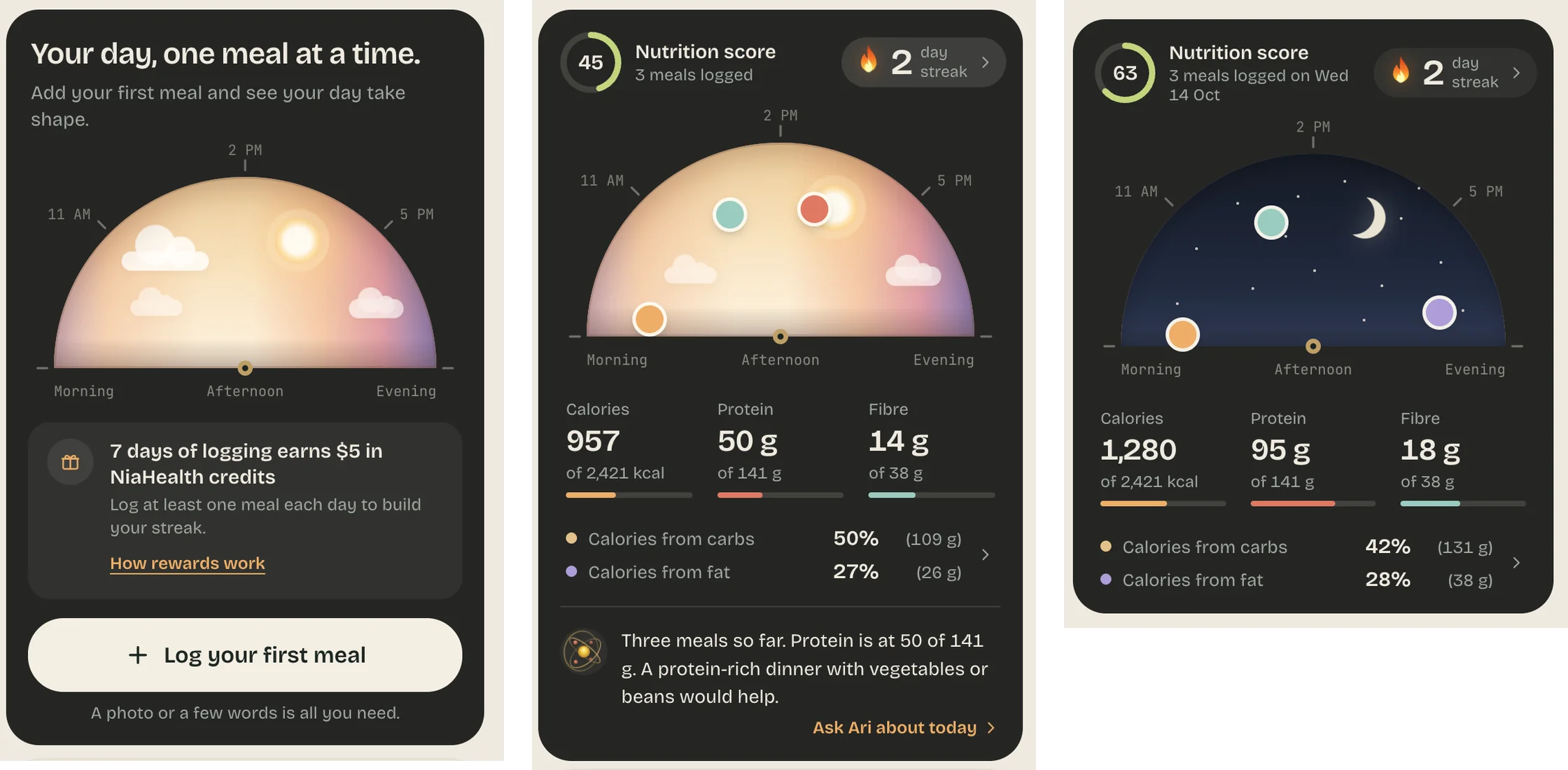
There is an old design idea beneath this. Dieter Rams argued that good design should make a product understandable. A familiar form can do some of the explaining before a word is read. Here, the movement from morning to night gives the information a natural order. You can see what has happened and the space still ahead. At 3pm, the sky shows you how today has gone: three meals logged, all in front of the sun. It also shows what comes next. The evening is still open, and Ari already has a suggestion for filling it.
That changes the question we hope someone asks when they open the app. “How is my day taking shape?” leaves room for curiosity and playfulness.
Your body already keeps time

Most meal trackers are built like a ledger: a list of entries and a running total against a target. Time is a column, if it appears at all. But your body doesn't keep a ledger. It keeps time. Our relationship with changing light runs deep. Circadian rhythms help organise sleep, appetite, and digestion, with light and darkness acting as powerful environmental cues. The dial borrows from this familiar rhythm. Its purpose is orientation: a small visual connection between the information on the screen and the day happening around it. It is a window in a place where you might expect a spreadsheet. So we started from the opposite end and built our meal tracker around the day itself.
Built for how health actually feels
This has a precedent in the humanist side of modernism. Alvar and Aino Aalto brought natural forms, warmth, and human comfort into modern design. In furniture for the Paimio Sanatorium, wood and carefully considered curves served the person sitting in the chair. How something felt was part of how well it worked. Food tracking can work against that. Calorie counts in red and missed targets can turn a meal into a verdict. We designed Today to take that pressure away. Nothing on the sky marks a meal as wrong. It simply shows your day as it happened, and gently helps you make better choices.
That is a useful standard for a health app. We ask people to pay attention to something personal, sometimes difficult, and often tangled up with how they feel about themselves. The emotional character of the interface belongs in the design brief.
“Warmth has work to do.”
The sky also gives us a way to welcome someone before they have anything to show. Before the first meal, before a score, before a streak, there can already be something inviting on the screen. We want that first encounter to say: you can begin here, with the day you are having.
…Then we need to get out of the way.
Open it, then get on with your day
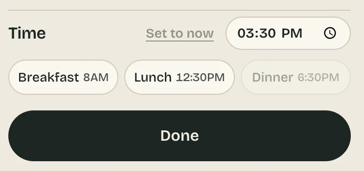
The smallest decisions carry our philosophy. The breakfast, lunch, and dinner pills put familiar choices directly under someone’s thumb. They can recognise the right option and tap it. The interface takes care of the structure.
That reflects a basic principle of cognition: recognition is generally easier than recall. Visible choices supply cues and reduce what someone has to work out for themselves. In this case, they also save typing and searching through controls. A sandwich should take longer to eat than to log.
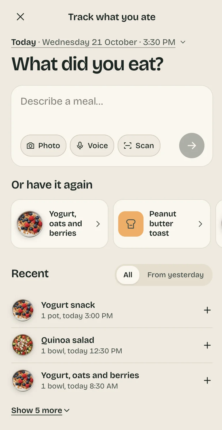
The same respect for attention connects our approach to calm technology, the design philosophy developed by Mark Weiser and John Seely Brown. They described technology that moves between the centre and the periphery of our attention, allowing us to stay informed while remaining involved in the world around us.
For us, that means a sky you can understand at a glance, detail when you want it, and a short path through logging. We want people to enjoy opening the app and feel free to close it.
What we owe you
The deeper ambition is that, over time, someone can look back and see evidence of their own effort. They made room for themselves on an ordinary Tuesday. Then they did it again for many days afterwards.
From the changing sky to the meal markers and the buttons beneath a thumb, each detail expresses a belief about the relationship we want with our members. Their attention is valuable. Their effort deserves acknowledgement. There should be pleasure in taking care of themselves.
The real measure of all this lives beyond the screen: someone understands their day a little better, records a meal without a fuss, and gets back to eating it while it is still warm.
Our editorial standards & process
At NiaHealth, our mission is to make proactive health possible for all Canadians—by combining science with humanity. We believe that rigorous, evidence-informed health information should never feel out of reach. Every word we publish is intentional. We choose language that empowers rather than overwhelms, clarifies rather than complicates, and respects the lived experiences behind every health question. Learn more here.